

Website and playground ·
GitHub ·
npm ·
sush.dev
# glyphfill
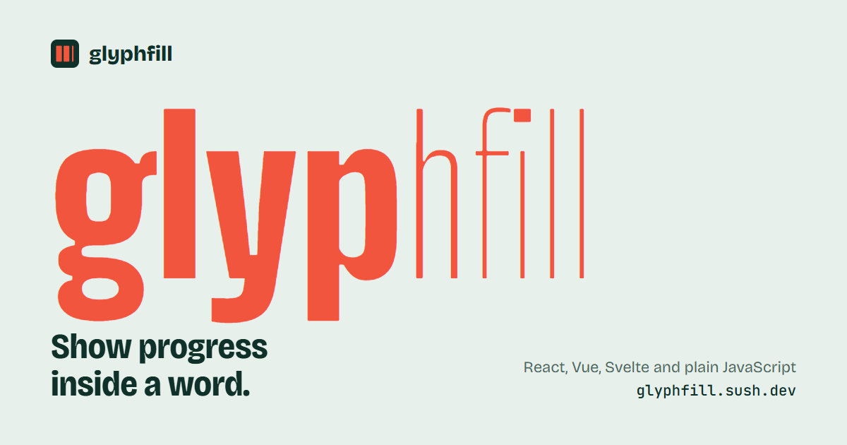
Show progress inside a word. As a task completes, letters get heavier or fill with ink. Hover the word to see "USAGE · 40% completed".
- Three modes: `sweep`, `fill`, `weight`, plus a loading state and a fill color
- Components for React, Vue and Svelte, and a plain JavaScript function for everything else
- Works with Tailwind CSS, shadcn/ui, Chakra UI, MUI, styled-components and Emotion
- No dependencies. Renders on the server, including React Server Components.
- Accessible: exposed as a `progressbar` with a readable value, has a keyboard-reachable tooltip, and respects reduced motion
## Install
```sh
npm install glyphfill
# or: pnpm add glyphfill · yarn add glyphfill · bun add glyphfill
```
Import the stylesheet once, in your global CSS or root layout:
```js
import 'glyphfill/styles.css';
```
With Tailwind CSS v4, import it into the components layer instead, so utilities can override it:
```css
@import "tailwindcss";
@import "glyphfill/styles.css" layer(components);
```
## React
```tsx
import { GlyphFill } from 'glyphfill/react';
USAGE
USAGE
USAGE
USAGE {/* no value yet: loading */}
```
It forwards its ref, and other props (`className`, `style`, `id`, events) go to the outer ``, so `asChild`, `styled()`, `chakra()` and `motion()` wrappers work. It has no hooks, so it renders in React Server Components.
## Vue
```vue
USAGE
```
Vue 3.3 or newer. `class`, `style` and listeners fall through to the outer ``. For Nuxt, add `'glyphfill/styles.css'` to the `css` array in `nuxt.config`.
## Svelte
```svelte
USAGE
```
Svelte 5. The component renders on the server; the action enhances the element after it mounts.
## JavaScript (Angular, Solid, Lit, Astro, plain HTML)
```js
import { glyphfill } from 'glyphfill';
const word = glyphfill(document.getElementById('usage'), { value: 40 });
word.update({ value: 75 }); // letters animate to the new value
word.destroy(); // puts the original text back
```
`glyphfill()` reads the element's text. Pass `text` to set it explicitly.
## Options
| Option | Type | Default | What it does |
| ----------- | -------------------------------------------- | --------- | -------------------------------------------------------------------- |
| `value` | `number` | none | Percent complete, 0–100, clamped. Leave it out to show loading. |
| `mode` | `'sweep' \| 'fill' \| 'weight'` | `'sweep'` | How the progress is drawn. |
| `minWeight` | `number` | `100` | Weight of the unfilled letters. |
| `maxWeight` | `number` | `900` | Weight of the filled letters. |
| `fillColor` | `string` | none | Any CSS color. Filled letters change to it. |
| `duration` | `number` | `300` | Transition length in ms. Turned off under `prefers-reduced-motion`. |
| `tooltip` | `boolean \| string \| (word, pct) => string` | `true` | Text shown on hover and focus. `false` hides it. `pct` is `null` while loading. |
| `text` | `string` | children | The word. Required for Svelte; React and Vue read children instead. |
## Modes
- **`sweep`**: letters before the progress point turn heavy, the rest stay thin, and the letter on the edge sits in between. At 40%, the five letters of `USAGE` get weights `900 900 100 100 100`.
- **`fill`**: solid ink covers outlined letters from left to right, like a progress bar shaped like text. Works with any font.
- **`weight`**: the whole word gets heavier together.
- **Loading**: with no `value`, a wave of weight moves through the word (in `fill` mode, a band of ink). Screen readers hear that it is loading.
## Fonts
`sweep` and `weight` need a [variable font](https://fonts.google.com/?categoryFilters=Technology:%2FTechnology%2FVariable) to move smoothly. With a static font, the browser snaps each letter to the nearest weight the font has. `fill` works with any font.
The word reserves the width of its heaviest form, so changing the value never shifts the text around it.
## Styling and UI libraries
The word inherits your font, size and color. glyphfill's root and tooltip rules use `:where()`, so they have zero specificity: any class you add wins, whether it comes from Tailwind, CSS modules, styled-components, Emotion, Chakra or MUI. The stylesheet is unlayered, so layered resets (Tailwind v4 preflight, Chakra v3) can't break it.
| Name | Kind | What it does |
| --------------- | ------------ | -------------------------------------------------------------------- |
| `--gf-fill` | CSS variable | Fill color. Same as the `fillColor` option. |
| `--gf-tip-bg` | CSS variable | Tooltip background. |
| `--gf-tip-fg` | CSS variable | Tooltip text color. |
| `--gf-stroke` | CSS variable | Outline width in `fill` mode. |
| `data-gf-state` | attribute | `loading`, `progress` or `complete`. |
| `data-gf-mode` | attribute | `sweep`, `fill` or `weight`. |
The attributes are prefixed so they don't clash with Radix, Ark or Headless UI, which set their own `data-state` on `asChild` children.
**Tailwind CSS**
```tsx
USAGE
```
**shadcn/ui** (a Radix tooltip in place of the built-in one)
```tsx
Usage
{used}% of your plan
```
**Chakra UI**
```tsx
const ChakraGlyphFill = chakra(GlyphFill);
USAGE
```
**MUI**
```tsx
const Word = styled(GlyphFill)(({ theme }) => ({
color: theme.palette.text.secondary,
'--gf-fill': theme.palette.primary.main,
}));
```
**styled-components / Emotion**
```tsx
const Word = styled(GlyphFill)`
color: #64748b;
--gf-fill: #16a34a;
&[data-gf-state='complete'] { color: #16a34a; }
`;
```
## Helpers
`computeCoverage(count, value)`, `computeWeights(count, value, min?, max?)`, `computeWeight(value, min?, max?)`, `graphemes(text)` and `createModel(text, options)` are exported from `glyphfill` for building your own renderer.
## License
MIT © [Sushil Buragute](https://sush.dev)